TWI

Monday, April 4, 2011
Blending 101 Selection Tool Method
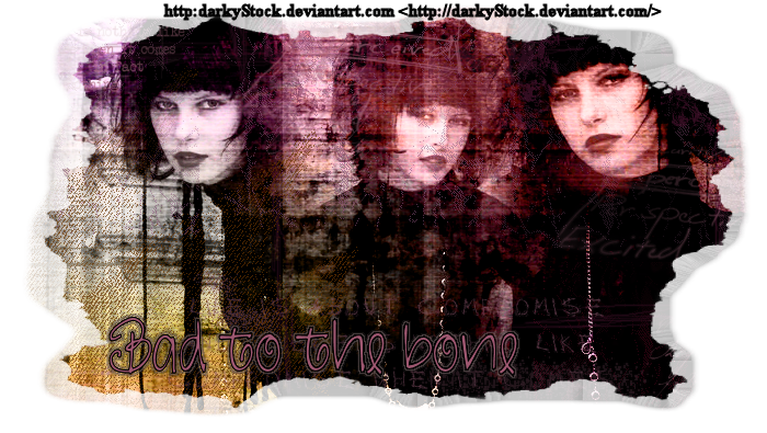
Bad to the Bone: Your first blend.
A tutorial by Genita Love for Morning Glory Designz.
For the first tut in the series, we're going to merely explore the selection tool method for blending. Any similarity between any other tutorial and this one is purely a quirk of fate. It isn't my intention to mimic or steal anyone's work.
I have uploaded the photos to illustrate this tutorial in my photobucket. Here is the link, if you are a visual learner:
http://s1121.photobucket.com/albums/l503/Genita_Love/blending%20tut%20photos/
Materials Needed:
Paint Shop Pro- I'm using 9. Any version will suffice.
Images to blend. I'm using the gorgeous stock photography from :Darky Stock.
You can find it here: http:darkyStock.deviantart.com
Two Moons: Trekkie San
Heartache Texture by Pendelstock. You can find it here:
http://pendlestock.deviantart.com/art/Heartache-65853891?q=&qo
Fibers Texture by the nightbird: You can find it here:
http://the-night-bird.deviantart.com/gallery/25063340#/d2zxpt4
Texture 61 by Sirius_sdz You can find it here:
http://sirius-sdz.deviantart.com/gallery/?offset=144#/d1nf5gc
Mask of choice with grungey edges. I used Masksstt2- I don't remember where I got it.If it's yours, please let me know, and I'll properly credit it.
Let's get started:
Open a new transparent canvas 700x600.
Copy and paste your images into the canvas as new layers in the same canvas.
I like to have the center image on the bottom layer. For me, this makes it much simpler in blending the two other images in. Makes for MUCH easier blending.
Use your Selections Tool, and set the feathering anywhere between 35 to 38. This nicely feathers or mists the edges so that blending is so MUCH more simpler.
To clear away the portions of the images you don't need, simply hit your delete key! You may have some small areas that need to be erased with your Fuzz Soft eraser. The best advice I can give you here is to experiment with the eraser size and opacity level to find what works for you. In a sense there aren't a lot of Hard,Fast Rules.
Blend each of the two images in with the center image. You'll need to use your layers palette and the move tool for this.
Feel free to move them as needed to achieve the look you want. I prefer to have the results looking like one flowing image, - meaning no lines of demarcation revealing where one image starts and the others
It doesn't need to be perfection. The finishing techniques used will turn any small flaw into a design element.
Once you have your basic blend the way you want it, now is the time to merge visible, and crop as desired.
And, that, is The Selection Tool Method of Blending! That is only half the job. Next, we'll move onto transforming it into a finished signature tag. Are you ready?
Now, on to the fun stuff!!!
Now that you have your basic, cropped blend, In your layer palette, duplicate it. Go to Effects, Plugins, Two Moons Trekkie San, and apply at the following settings:
Set your Phasers to: 37
Intensity: 47
Dark Wars: 32.
In your layers Palette, change your blend mode to screen and lower the opacity to 92.
Merge Visible.
In your layer Palette, add a new raster layer. Open the Heartache texture, using your magic wand on your blend canvas, click on your new raster layer. Copy the texture into the selection. Change the blend mode to burn, and lower the opacity to 72. Using your Fuzz Soft eraser, with the opacity at 26, lightly erase away any gray bits that look unsightly to you in the facial areas of your blend.
Merge Visible.
In your layer pallet, add a new raster to your canvas. Open, copy and paste the Fibers Texture by the Night Bird into it.
Change your blend mode to Overlay and the opacity to 72. Merge Visible.
Right click on your layer palette, go Merge, Merge Visible.
In your layer Palette, make a new raster layer, using the magic wand click on it in your canvas. Open Texture 61 by Sirius sdz, copy and paste it into your selection.
Change the blend mode to Color Legacy. If needed, again, using your fuzz soft eraser, lightly erase in the facial areas of your blend as needed, if at all.
For a few layers, add your brush work. Grunge, or even various text brushes. Whatever you happen to have. The trick to this part is lowering opacity, changing blend modes, a little bit of light erasing as needed to get the look you like. The other crucial trick to this is using your Eye Dropper tool, clicking on your blend to lift colors out of your blend so that the brush work is subtle, yet noticeable.
Merge Visible.
Add copyright information and personalization. Save as a .png
My personal challenge to you:
There is a reason I'm not giving you detailed instructions for this part. This is to help you learn to trust your own eye- learning what works, and what doesn't. Also to help you develop a better eye for color as well. While I am giving you the basic tools, I'm also encouraging you to venture out on your own, learning by trial and error. I don't think that tuts are really meant to hold a tag maker by the hand. Rather,I think their purpose is to teach new techniques to further your skill and artistry as a signature tag maker. In all honesty, I think the cookie cutter mentality, following a tut book chapter and verse is boring. I really don't have the patience to be a cookie cutter sort of tagger. -Like some of my fellow taggers at Creative Misfits say: Be original.
(And, do they ever rock MY world with their tagging efforts and originality! Ladies, you SO rock!!!!)
If anything, I really would rather see people taking the techniques I use and make their tags their own- be original...be unique. Why be cookie cutter? I've also learned as a Tag Maker that in going my own way with the BEST materials available, that my skills, artistry, and originality as a tag maker have been well served by learning by trial and error
Really, for all intents and purposes, my tutorials are like a Twelve Step Meeting- Take what you like and what you've learned, and discard that which doesn't work for you. - With that in mind, I honestly DO NOT mind it when people take what I've shared and make it their own. - That's what I'm in it for! To watch my peers in the PSP community learn and grow as Taggers. I certainly don't expect anyone to follow my tuts book,chapter and verse.
By all means you do NOT have to download every resource I suggest. Use what you already have. Make the skills and techniques uniquely your own! For ME that's what Tagging is all about- a visual representation that is uniquely you!
Blending 101: Basic Theory
Blending 101: Basic Theory.
I thought I'd take this opportunity to address a technique in signature tag making- That being blending. It really isn't that intimidating or difficult, once one masters the skill set needed for the technique. If one noodles around the internet, there are some amazing blends to behold. Since I've returned to the PSP community, I've seen the intimidation of many of my peers when faced with this technique. It really isn't that difficult.
For our purposes here, I'm going share what I've learned- and the progressive journey I've traveled from my first blend several years ago, up to what I regularly employ currently in my blending. Please allow me to encourage you , and, yes, admonish you. I'm merely sharing what I've learned to be most effective when making a basic blend. What may be particularly effective for me may NOT be the magic bullet for you. All I can ask is that you at least try what I'm sharing with you, here.
First, What IS blending. It is taking three images of the same subject, preferably from the same photo shoot., and manipulating them until they make a composite whole image. - The quick dirty version taking three similar images and combining them into a whole, new, different image.
Secondly, The Basic Blend is only half of the equation. What makes it pop and come alive is what you add to it to achieve the finished product. There are a variety of things that can be used. There are textures, external plug in filters, word art, fonts for personalization and brushes. These are the things that bring life to the basic blend.
Thirdly,there are several methods to create a basic blend.
A. Exclusive use of the eraser tool: I've tried this, and found it a little too fussy, and nowhere near as precise or simple as I'd like- why make it harder than it has to be? What's helpful is using the Fuzz Soft at a lower opacity level.
B. Using the Selections tool. I've found this to be a simple alternative. The key to this is using the feathering setting. I normally use anywhere between 35-38 for this. - With very little erasing involved. Nice and simple, especially if going for a dense, rich basic blend.
C. Clone Brush. I've found this very well suited for a light, delicate basic blend- somewhat similar to blends I've seen done in Photo Shop. It “Mists” the selection of the image cloned. Again, minimal erasing is necessary.
There are a couple of other techniques that can be used in blending that I have yet to attempt. - Masks and using the selections tool to trace around the portion of the image to be blended into the main image. I have no clue how effective or simple these are. I can only speak of which I have had personal experience attempting.
With that being said, this is the blurb detailing the beginning of my Blending 101 series. I see absolutely no sense in setting anyone up for failure, so, I'm going to first share the selections tool method I've used for years- You'll see JUST how simple blending can be! The second tut in the series will illustrate using the clone brush method. The third, for sake of comparison will be the eraser method.
New Tut Series....
Since I've seen so many of my peers struggle and appear intimidated with blending, I decided that there needs to be a basic blending tut series.... The next four posts will deal primarily with Blending basics.
1. The first in the series will deal primarily with theory,and my take on the methods used to create a basic blend.
2. The second tut will feature using the selections tool method.
3. The third will feature using the Clone Brush Tool.
4. The fourth will feature the eraser method.
I'm debating if I should focus my blog tut site exclusively on blending.
(I'm also considering putting up a poll to determine if my 'followers' or those reading my blog wish that to occur. So, your feedback is really needed.)
Friday, April 1, 2011
Everything Cherries : New FTU Tut
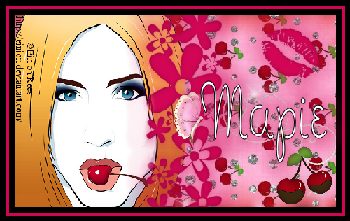
Everything Cherries Mini Tag (FTU)
A working knowledge of Paint Shop Pro is necessary.
I'm using PSP 9, any version would work.
Materials needed:
Pop My Cherry kit from Pink Princess Scraps – You can find it here:
http://pinkprincessscraps.blogspot.com/2009/09/ptu-now-freebie-pop-my-cherry.html
Tube of choice. I'm using the vector art work of Einon Rees. - You could use any tube you like, if so desired.
Xenofex2 Burnt Edges
Eye Candy 4000- Gradient Glow
Font of choice. I'm using Noodle Doodle.
Let's get started:
Open a 500x300 transparent canvas.
Open paper 6, and Shift D, to duplicate it. In the Materials palette, activate the patterns, and select paper 6. Change the angle to 90, and the scale to 75. Flood fill canvas.
Use Xenofex 2 Burnt Edges, change the burn color to red. Apply. Resize canvas by 120%. Apply Eye Candy 4000 Gradient Glow, Faint White setting, change the pixel setting to 34.63, Soft Corners to 7%, and the opacity to 34. Apply.
Open your tube of choice, and resize by 80%. Copy and paste as a new layer, move it to the left side of the canvas. I erased part of the lower right hand corner to eliminate that bit of purple there. Add a drop shadow.
Open Element 25, Go Image, Rotate, Free Rotate, rotate by 90 degrees to the right. Apply the Gradient Glow, and a small drop shadow. Position the element as shown.
Open Element 21, Shift D to duplicate, close the original. Resize to 30%. Apply the Gradient Glow, Go Image Rotate, free rotate, rotate by 30% to the right, and position as desired.
Open Element 71, copy and paste as a new layer, moving it to the right side of the canvas.
Open Element 6, Shift D, to duplicate. Close the original. Resize the copy by 30 percent, position as shown.
Open the chocolate covered cherry element, Shift D to duplicate, close the original, resize the copy by 30%. Position as shown.
Open element 57 (the string doodle.) Shift D, close the original, resize the copy by 70% twice, position as shown, and arrange the layer in the layer palette as shown.
Merge Visible.
Go to Image, Add Borders. With Symmetric checked, add a black border that is 8 pixels wide, using the magic wand, click on the border, and add a drop shadow. Select None.
Go Image, Add Borders, this time make the border red, and 6 pixels wide.
Again, go Image, Add Borders,do another black border, 8 pixels wide. Use the magic wand, click on the second black border, add a drop shadow, select none.
Add copyright information/artist credit and Personalization. I used Noodle Doodle font, size 36, black as the foreground, white as the background. Apply Gradient Glow and a drop shadow.
Merge Visible. Resize by 92%, all layers checked. Save as a .png.
Monday, March 28, 2011
New FTU Blend Tut: Denim Splendor
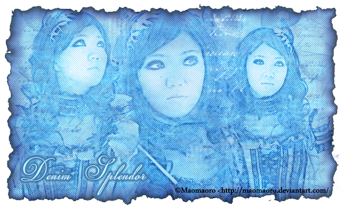
Denim Splendor : Blend Tutorial by Genita Love
for Morning Glory Designz
A working knowledge of PSP is necessary. I'm using PSP 9. Any version will suffice.
Materials Needed:
The images I'm using here are from last week's Creative Misfit's blend challenge.
The proper credit is: ©Maomaoro http:Maomaoro.deviantart.com
Xero Pastelise
Xenofex2 Burnt Edges
Penta Jeans
Shiny Icicles texture by Ro Stock. You can find it here http://ro-stock.deviantart.com/art/Shiny-icicles-70963703
Texture 43 by Sirius_sdz You can find it here: http://sirius-sdz.deviantart.com/art/Texture-43-97651997
Seasons of Winter 5 texture by Inthename Stock. You can find it here: http://inthename-stock.deviantart.com/gallery/?offset=168#/d1qr352
Seasons of Winter 13 texture by Inthename Stock: You can find it here: http://inthename-stock.deviantart.com/gallery/?offset=168#/d1rbc0j
Gorjuss Text Brushes. You can find them here: http://gorjuss-stock.deviantart.com/gallery/?offset=24#/d9amhv
Let's get started:
Open a new, transparent canvas, size 700x600.
Open your images to blend, and resize as needed to fit your canvas.
Using the clone brush, add to your canvas. (I used the maximum size setting, full opacity.)
Add a raster layer, use the clone brush again, and add the second image, position as desired.
Add a new raster layer. On the original, resized third image, go image, mirror. Add the third image.
For your main image, duplicate. For the other two, lower the opacity to 74, leaving the Blend Mode set at normal.
Use the Fuzz soft eraser, size 65, opacity 40 to erase the bits needed to blend in the images a little better. Merge visible, Crop as desired.
Duplicate your basic blend, use Xero Pastelise.
Change the blend mode to Screen, and lower the opacity to 62.
Merge Visible.
Add a new raster layer, using the magic wand tool, click on the new layer to select all. Copy the shiny icicles texture into the selection, on the layer pallet, move it to the bottom.
Add a new raster layer, use the magic wand tool to select all. Copy and paste Texture 43 into the selection, changing the blend mode to Color Legacy.
Add a new raster, use the magic wand to, click on the new layer, copy Seasons of Winter 5 texture and paste into the selection. Change the blend mode to Overlay. Use your Fuzz Soft eraser, at the same settings as before, and erase a little of the texture away in the central image's facial area.
Add a new raster layer, use the magic wand to click on the new layer. Copy Seasons of Winter 13, and paste into the selection, Change the blend mode to multiply, lowering the opacity to 38.
Use the Fuzz soft eraser again, erasing in the facial areas of the image.
Merge Visible.
Apply Penta Jeans.
Apply Xenofex2 Burnt Edges at the following settings:
Expand/Contract: 6.19; Burn width 24; Change the burn color to a dark blue in your blend, and lower the opacity to 69.
Add a new raster layer, using the dropper tool, select the lightest color, using your paint brush tool, apply the Gorjuss txt brushes as desired, adding layers selecting shades of blue from your blend, alter opacities as desired until you have a look you like.
Merge Visible.
Add Personalization. I used the Champignon font, size 36.
Add Copyright information and artist layer.
Save in the .png format.

New FTU blend Tut: Friendship

Friendship blend.- A Blend Tutorial by Genita Love for : Morning Glory Designz
Any version of Paint Shop Pro will work, I happen to be using PSP9. A working knowledge of PSP, and blending is preferred.
Materials needed:
Images to blend. I'm using the beautiful stock photography of -Isis
You can find her gallery here: http://tanit-isis-stock.deviantart.com/ Please take heed of her TOU.
Two Moon's Trekkie San
Xero Nostalgia
Your choice of textures. I'm using :
Texture 57 from Wandering Soul_Stox you can find her textures here: http://wanderingsoul-stox.deviantart.com/gallery/840039
Old _Newspaper texture by Powder Puff Jazz. You can find the texture here:
http://powerpuffjazz.deviantart.com/art/Old-Newspaper-Texture-130413322
Pretty 29 by Inthenamestock. You can find it here:
http://browse.deviantart.com/?qh=§ion=&global=1&q=pretty+29#/d15b831
Let's get started:
In PSP open a new transparent canvas, 700x 600.
Open your chosen images, and resize as needed to fit your canvas.
Copy and paste two of them in to your canvas.
Use your selections tool, set with a 38 heather. Make a small selection to blend the two together.
Add a new raster layer.
Using your Clone brush add the third image to your canvas.
Using your Fuzz soft eraser with an opacity level of 24, and the size sat at 74, lightly
erase around the third image to blend in with the other two- So as to blend it all in a little better.
Merge visible and crop as desired. - There is your basic blend!!!
Duplicate this.
Apply Two Moons Trekkie San at default settings. Change the blend mode to
over lay. Merge Visible.
Duplicate again,this time use Xero Nostalgia (You'll need to use the random button until you find a look you like.) For mine, I changed the blend mode to Multiply, and lowered the opacity to 62. Merge Visible.
Add a new raster layer.
Using your magic wand, click on your canvas, so as to select all.
Copy and paste Old Newspaper texture by Powder Puff Jazz into the selection Change the blend mode to overlay.
Copy and Paste Pretty_29 by Inthenamestock, change the blend mode to soft light.
Copy and paste Texture 57 from Wandering Soul_Stox into selection. Change blend mode to Color
Legacy.
Select None, Merge visible.
Add new raster layer, and use the Agi Brush 63. as desired. Change the blend mode to Luminance, and lowered the opacity to 46 .
From there, I added extra layers, and used additional brushes..grunge, grid,ect lowering the opacity to 46. until I had a look I liked. - Just play with it from here for a couple layers.
Merge Visible.
Go to Layers, Load Save Mask from disc, Apply mask 43 Kris. With out the transparency checked.
Add the personalization or other desired text.
Add copyright information.
Merge Visible.
Tah Duh...You're finished! Save your work...especially after all that effort.
Subscribe to:
Posts (Atom)